
Tabs Widget
The new Tabs widget is an excellent way of displaying content efficiently on your site. Visitors can click between tabs (rather than scroll through text) to view related content. Tabs are a great way of showing content such as Services, Plans or Team members in compact, connected sections.
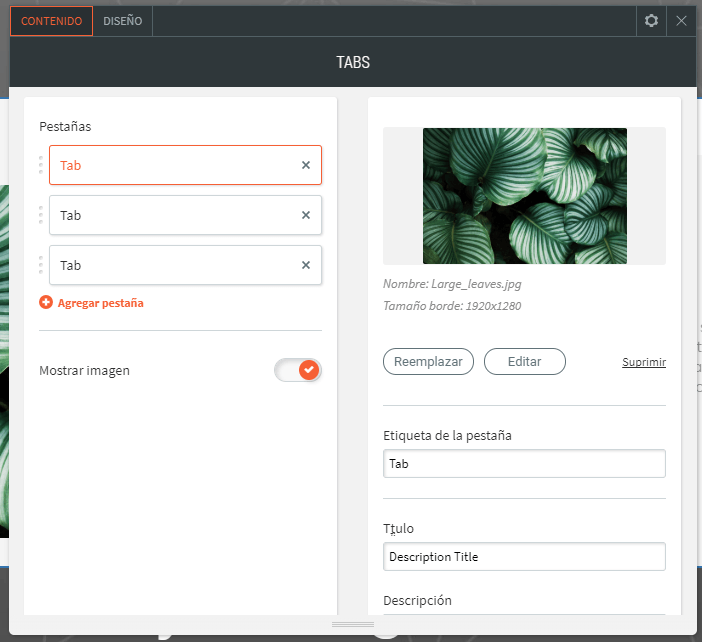
Each tab can contain a label, title, description, image and button, and each of these elements can be fully customized.
- Add the Tabs widget anywhere on the page. To learn more about adding widgets to your website, see Adding Widgets.
- Once the widget has been placed, the Content Editor will appear.
- From here, you can add or remove tabs and switch their order. You can edit the tab label, title, description, image and button.
In the design editor, you can choose from several predesigned layouts, and customize the style of the tabs. Click All Tabs to customize the style of unselected tabs, reverse the tab direction, and control the tab layout on mobile. Click Selected Tab & Hover to customize the text style and background. Controllers for the text style, button style and image style are here too.
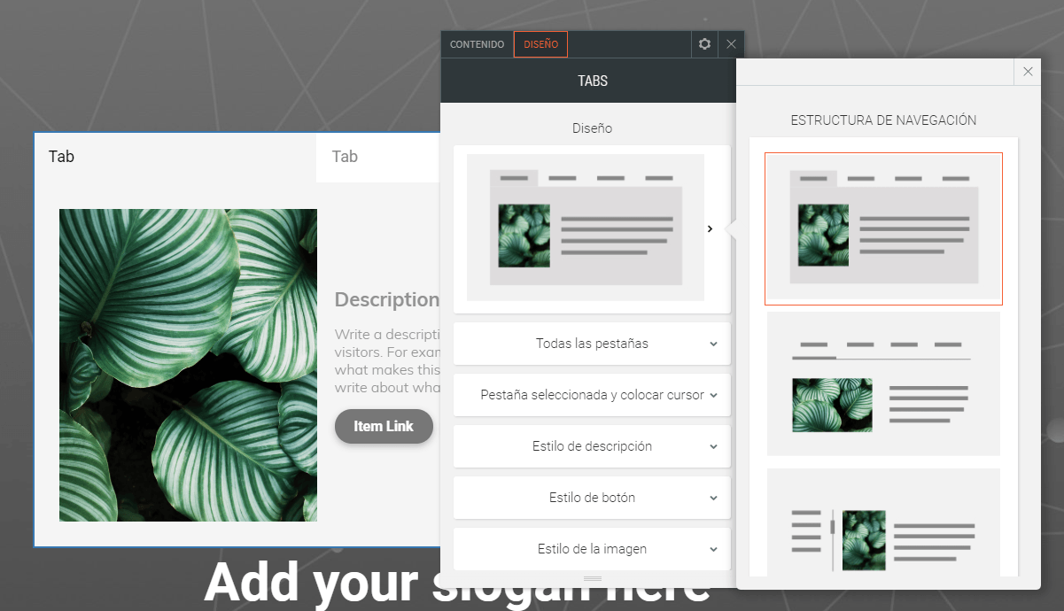
When you customize the “Selected Tab & Hover” design, this does not affect the “All Tabs” design.
You can have as many tabs you want, but keep in mind that the space for each label is reduced with each new tab.
There are 2 layout options for mobile display, tabs and accordion. The tabs layout can be controlled by swiping.
You can have as many tabs you want, but keep in mind that the space for each label is reduced with each new tab.
There are 2 layout options for mobile display, tabs and accordion. The tabs layout can be controlled by swiping.