
Adding Buttons
Buttons are the easiest way to get website visitors to take action. Buttons can lead visitors to another page on your site or to a page on a different website. Buttons can also open a popup, contact form, online reservation, email address and more.
Add the Button widget onto your website. To learn more about adding widgets to your website, see Adding Widgets.
Content Editor
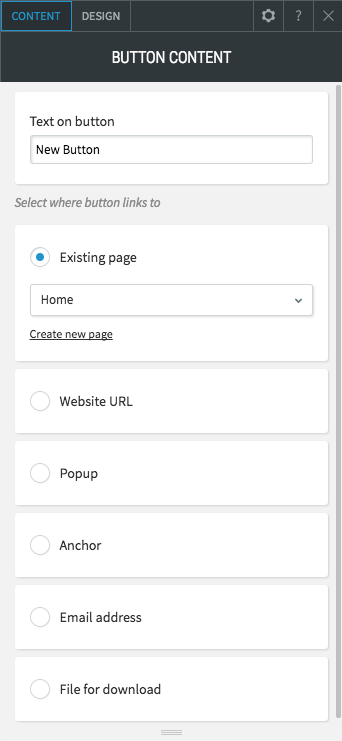
Use the content editor to select a button destination. The following destinations can be set for your button:
- Existing Page: Send the visitor to an existing page on your website.
- Website URL: Send the visitor to a specific URL.
- Popup: Open a popup. Choose from popups located in Pages & Popups or create a new popup.
- Anchor: Send the visitor to an anchor on any page in the website.
- Store link: Prompt the visitor’s device to open the store login or product page.
- Email address: Prompt the visitor’s device to open an email client with a specific email address.
- File for download: Prompt the visitor’s device to download a specific file.
Design Editor
Use the design editor
to choose between the different button layouts, make edits to the button style (width, height) and button text (font, text size), and adjust the inner and outer spacing. You can also make edits to button design by using the global button design menu.
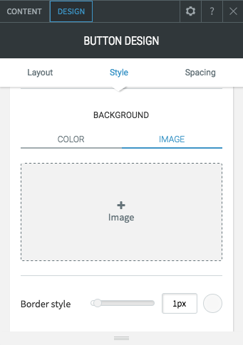
Add a Button Background
You can add a background color or image to a button. Adding a background using the global button design menu will change the background of all buttons. Adding the background to an individual button will change the background to that single button.
Selecting Button Icons
Choose from our font-icon collection to decorate your buttons or navigation menu. Icons make it easier for visitors to identify buttons without needing to read their labels. Icons can be colored and combined with text to make unique buttons that will attract visitors' attention.
- Click the button widget to bring up the Context menu.
- Click the Design tab to bring up the Design Editor.
- Select a button layout that uses icons.
- Scroll down to the Style section. Make sure the Show Icon option is turned on.
- Click the Choose Icon button to bring up the Icon Picker.
- From the Icon Picker dialog, click an icon to add it to your button or navigation.
To more easily find the icon you're looking for, type in a subject or name you'd like to find an icon for, or use the dropdown.
** Only some button or navigation layouts support icons. Try various button styles to achieve your desired look.

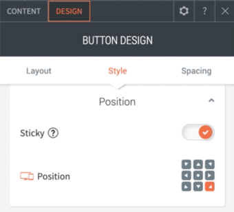
Adding Sticky/Floating Buttons
Sticky buttons allow you to keep a button visible at all times, even when a visitor scrolls down the page. Use sticky buttons to keep important calls to action fixed, visible, and clickable on all site pages.Click the button widget to bring up the Context menu.
- Click the Design tab to bring up the Design Editor.
- Scroll down to the Style section. Make sure the Show Icon option is turned on.
- Toggle the Sticky option on.
- Choose the position per device.
Some things to consider:
- The size and position can be customized per device
- On mobile, we suggest placing the sticky button at the bottom corner of the screen so visitors can easily click it with one hand
- You can display an icon rather than text on mobile by choosing the layout that features an icon on mobile
- For multi-lingual sites, sticky buttons will only appear for the default language
- If the Sticky attribute is disabled, the button will automatically appear in the first row at the top of the page
- The Sticky button cannot be hidden on specific pages
If you need help on editing the design of your widget, visit our Widget Design
page.